Overview
Below is a step by step example showing how you can find specific information and download a PDF from the constituency dashboards.
Get a printable version of this page.
Query
Find the areas (EDs) where the highest number of people are renting from a 'Private Landlord' (occupancy type) in the Dublin Bay North constituency and download a PDF of the results.
Steps
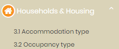
- Click on the Households & Housing theme icon in the side-bar menu.
- Click on the indicator labelled 3.2 Occupancy type.
- Allow the dashboard to load – usually 5-10 seconds depending on your internet connection speed and your computer.
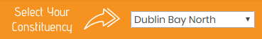
- Depending on whether or not you have already changed the default constituency choice, you may need to adjust the constituency selector dropdown (found in the top right of the page) to read Dublin Bay North.
- The dashboard will be as shown:

- The map is coloured to show the % Rented from Local Authority. This is the default map layer for this indicator and can be changed by clicking the dropdown box. We want to change this to % Rented from Private Landlord.
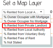
- The map will change to show the data for those renting from a private landlord.

- We can now see that there are relatively high areas of people renting from a private landlord along the southern and western side of the constituency, alongside an area in north of the constituency.
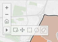
- Draw on the map to select the EDs along the southern and western side of the constituency by bring your mouse over the map and holding down left-click while drawing a shape. The lasso or free-hand tool is enabled by default.
Other map controls can be accessed from the map control menu which appears in the top left of the map whenever your cursor is on the map.
Your result may appear as follows:

- Next, we want to add in the northern ED which had also displayed a high share of people. To do so, we want to ctrl + left click on it to ‘add’ it to our existing selection. If we were to click on it without holding down the ctrl key, it would select the ED but clear our previous selection. You can hold ctrl + left click and draw as well. Your result will be as follows:

- If we scroll down the page, we can see that the charts correspond only to the selected EDs – both the individual ED by ED charts and the aggregate chart (combining figures from our selection).

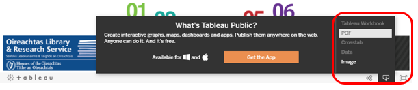
- To export a PDF we can use the built-in function at the end of the dashboard. However, if you only need a screenshot you can open programs like ‘Snipping Tool’; (on Windows 7/10 computers) to make the process easier. Press the download options button in the toolbar at the end of the dashboard and press the PDF option.
- A dialog menu opens showing options to configure the PDF layout. The following will usually yield a good result, but change as needed:
- Change the paper size to A4
- Change scaling to at most 1 page high
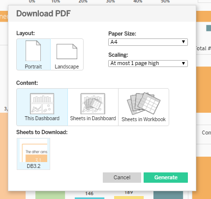
Other options include only PDFing certain parts of the dashboards, such as the map. These can be found by clicking sheets in dashboard – and a preview will be shown in the menu.
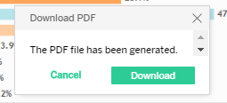
- Click on Generate to prepare the PDF. When complete you will see a prompt to download. You may need to scroll up the page a little to see the download prompt window.
- Our PDF displays as follows when opened:
